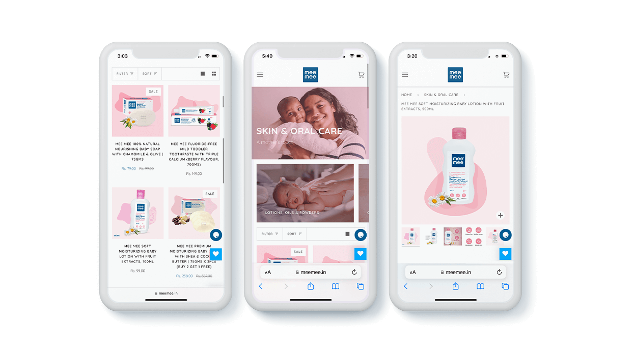
When you step into a store, would you like it if you were attacked with offers, products and salesmen overloading you with information about things you’re not even in to buy? Well, no one would. So why should e-commerce solutions be made to keep the noise front and centre of the online destination? And when it’s for a baby brand, well there’s no place for drab and boring colours either.
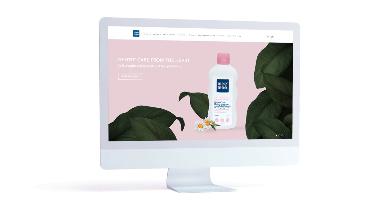
That’s what we did for Mee Mee. We removed all the clutter and streamlined their offerings. So when someone visited the website, they could easily find what they were looking for.
We made it enticing enough for them to then stick around and peruse for other products that would help them as well as their babies.
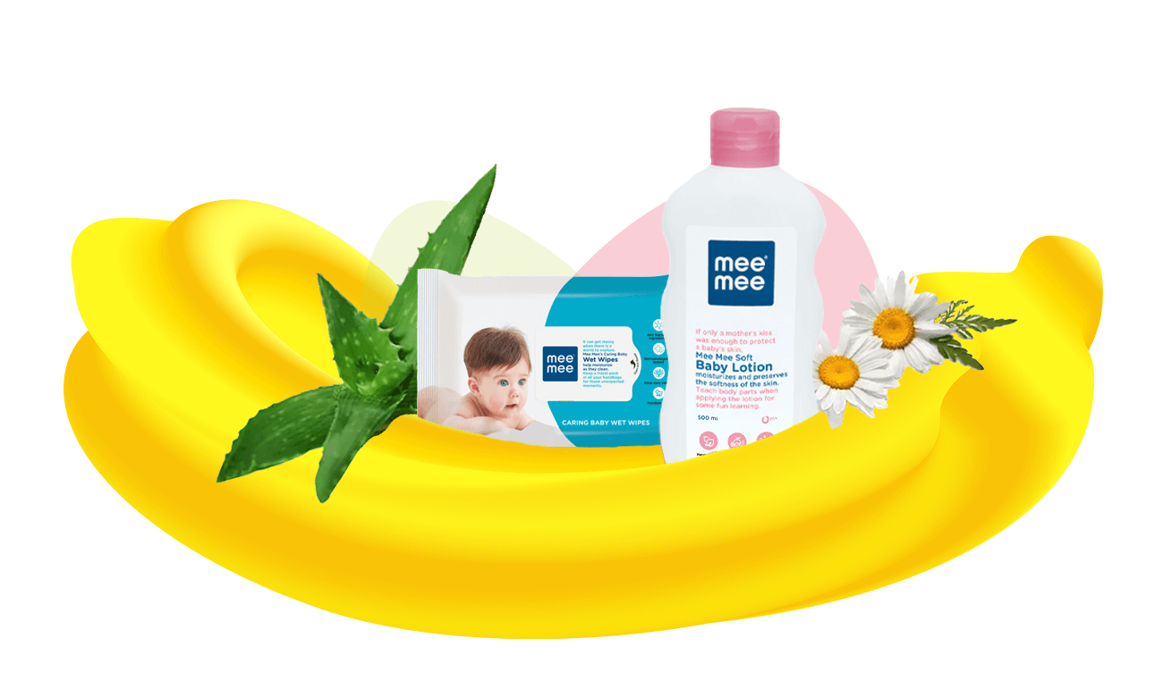
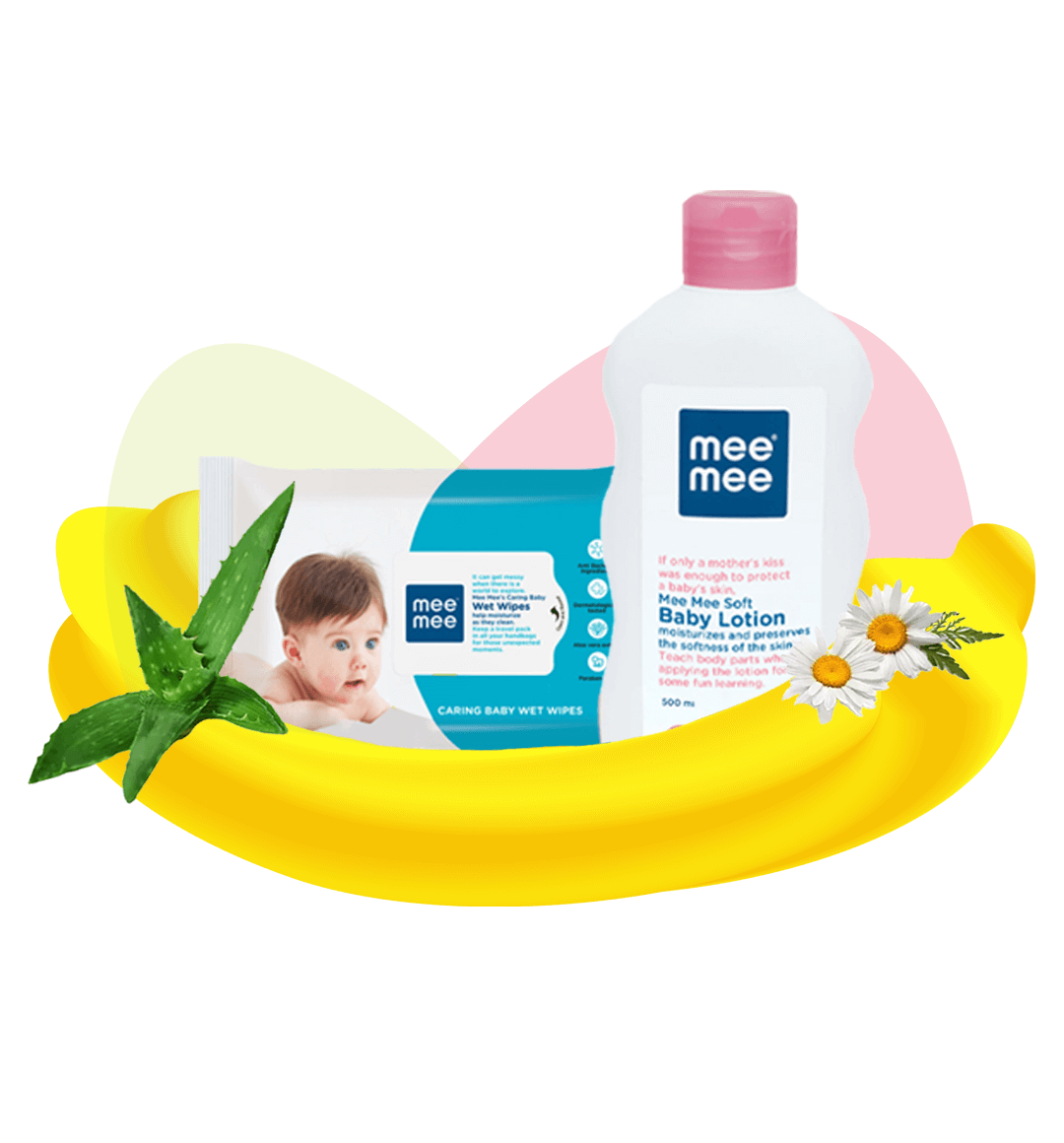
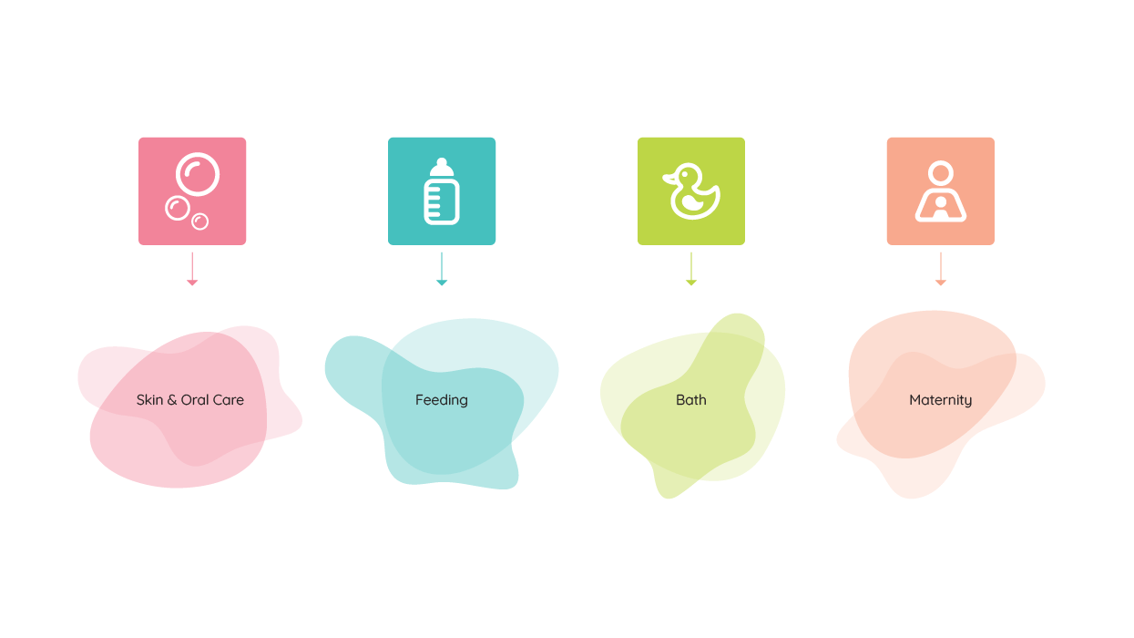
We crafted a visual language for the e-commerce solution using colours which are essentially baby friendly. Pastel shades of blues, greens and pinks were picked for different categories. We then created graphical elements that were placed as if dancing around the product. This brought alive the entire product offering page. It made the e-commerce solution look good and come across as soft and playful. Just like the baby care category itself.
