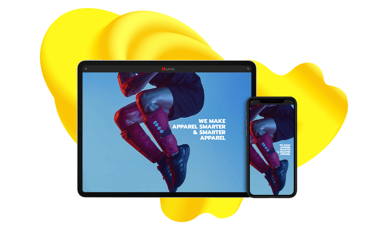
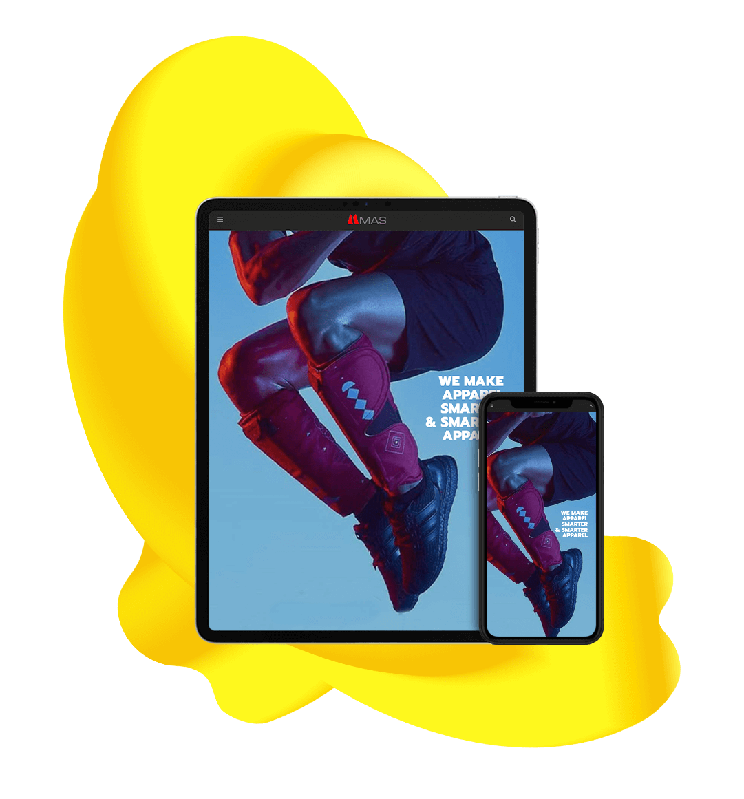
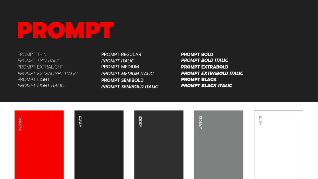
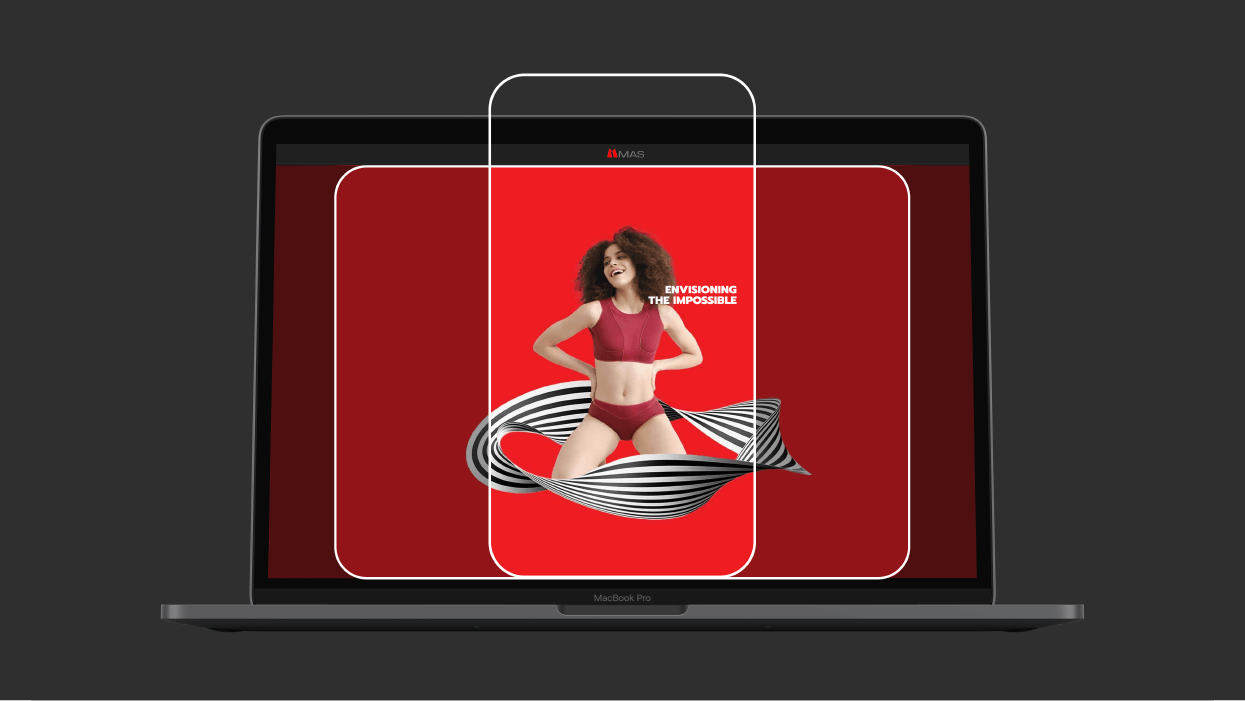
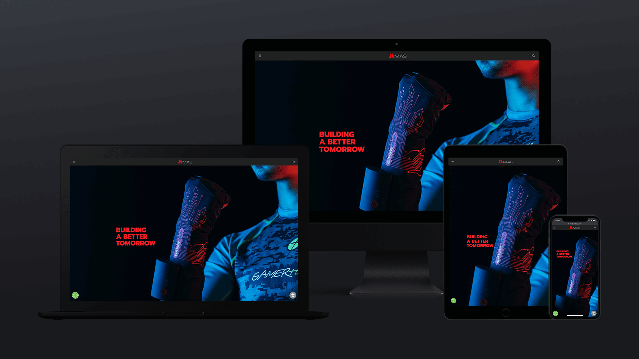
Yes. That’s how we built MAS Holdings. That’s what good UI/UX design can do. It can bring together different companies, each performing a distinct role and serving a diverse range of offerings, with a stunning, yet simple, singular design language. The new online destination was created to showcase MAS as an organisation that has and will continue to shape the future of the apparel industry. An organisation that is integrated in its offerings with solutions that are driven by the forces of innovation, technology and sustainability.
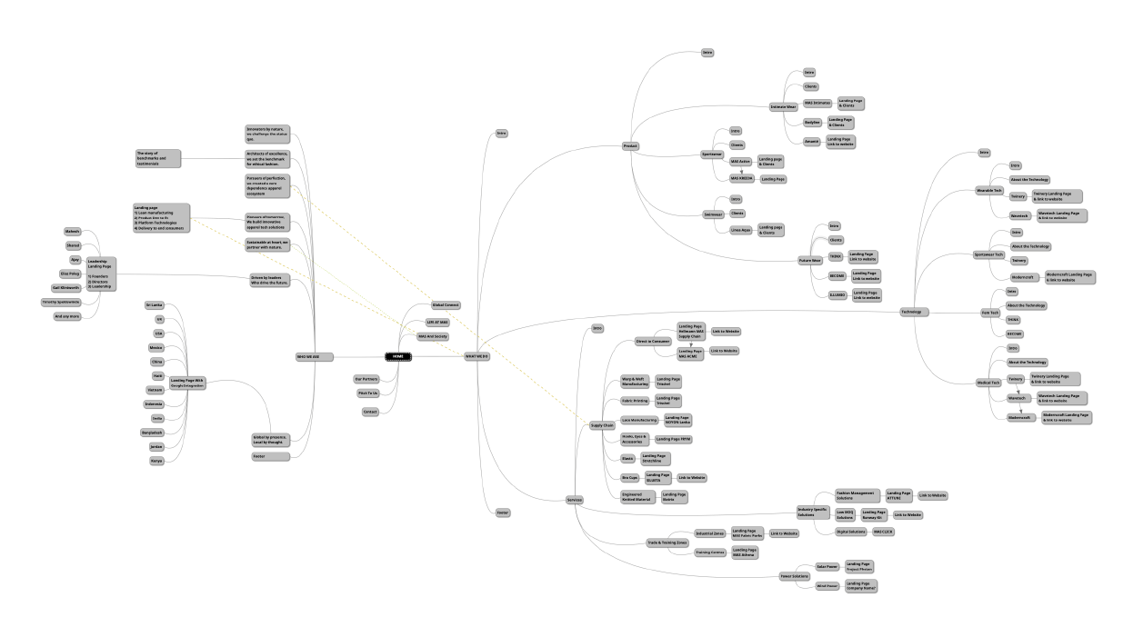
But as Steve Jobs rightly said, ‘Design is not just what it looks like and feels like. Design is how it works.’ So, our UI/UX design journey started by putting order to chaos. It is no mean feat to build a structure for the world’s largest apparel technology conglomerate. We mapped different points of entry, that would lead visitors to the information they have come looking for.
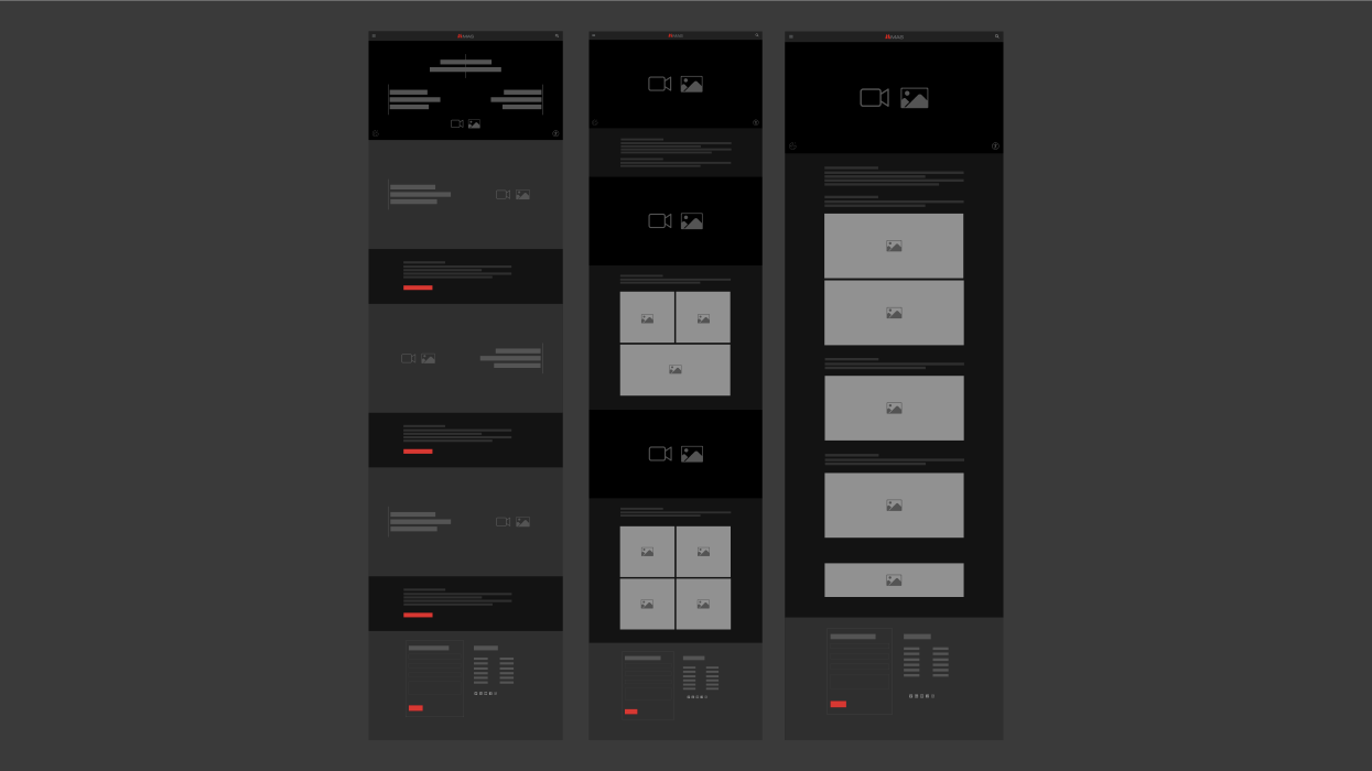
With this in mind, we set out to design three interfaces that would go on to power the entire website. Interfaces so dynamic in design, structure and build, that no two pages will look like each other.
That’s how good UI/UX design should work. It should be liberating instead of restrictive. Where the framework set, works as a springboard for an organisation to keep the website looking fresh and updated at all times.
But the hallmark of a good UI/UX design is a robust backend. We built the backend of this online destination with finesse. So entire sections on the website can be created in under 10 steps. That’s right. Just 10. Because that’s how simple managing a website should be. We took care of the complicated, so to manage the website, one simply has to log on.
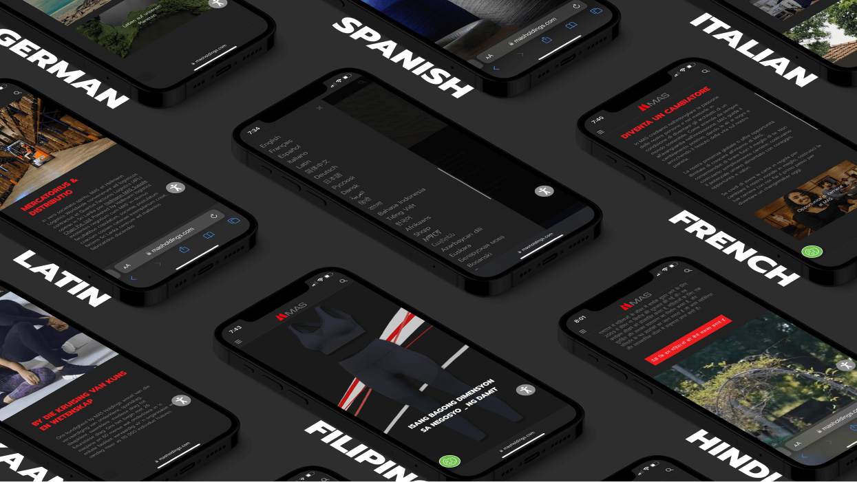
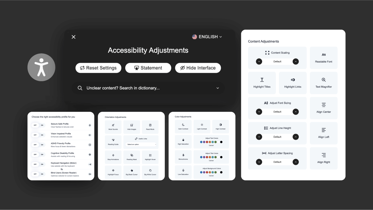
We built the online destination incorporating the ethos of the company. As a global company with a large heart, one of the company’s cornerstone is its diversity and inclusivity. Hence, we made the website speak a 104 different languages and made it accessible to all, including those who are differently abled. Now, that’s a power packed UI/UX design.
